For the Love of Lettering
Whether you have a love of ligatures, admire the craft of kerning, or perhaps (like many) didn’t even know typeface design existed, we all come across letterforms everyday of our lives. Usually, these will be meticulously created typefaces found in print and, more often now, on screens.
These fonts attain their own personalities and can evoke certain emotions; they are the product of carefully manufactured grids and guidelines, with an overall aim for perfect legibility (well, most of the time).
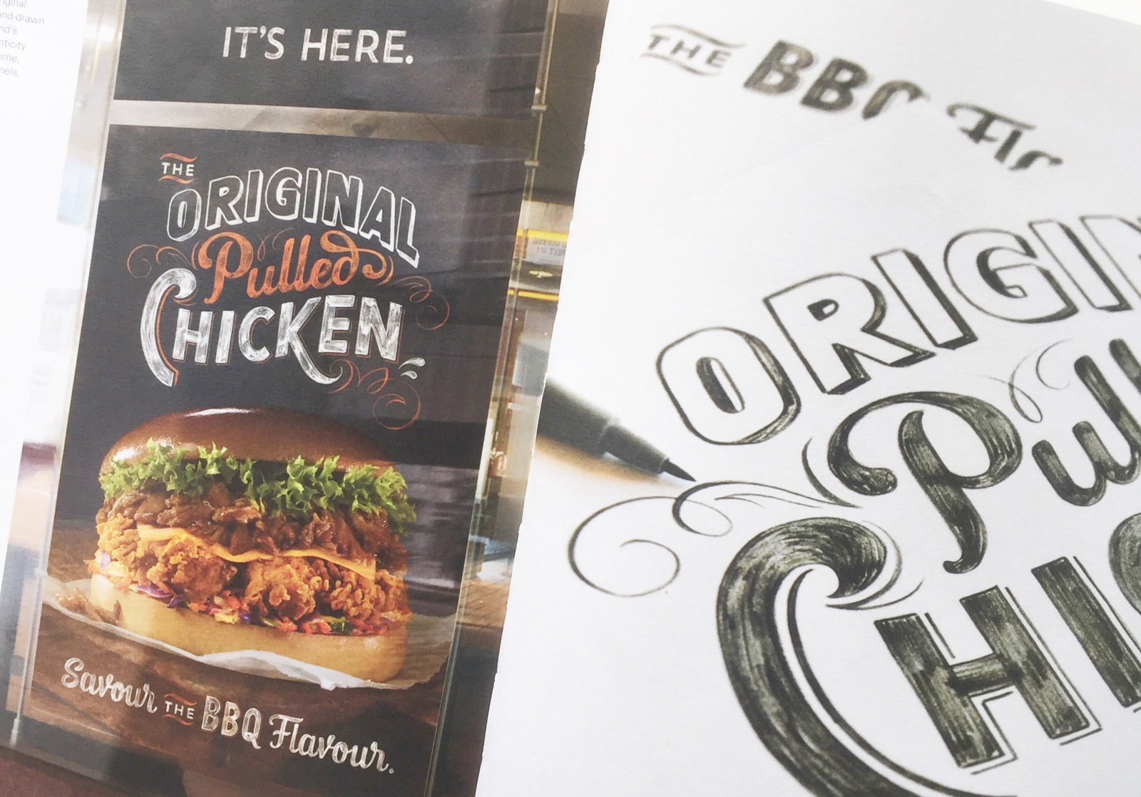
However, it’s the hand lettering branch of the typographical family tree that has been growing wild over the last few years, seemingly appearing in various forms of media such as advertising and logo design to name a few.
Hand lettering breaches the accurate and precise grids of typeface design and has a tendency to lean more towards art and illustration. Though, of course, there are some type design rules still addressed within hand lettering (for example keeping the correct weight placement within a letterform) and likewise some artistic expressivity within graphics/type design (David Carson holler at me), I feel that hand lettering has a wonderful juxtaposition between the worlds of art and design.
Is this happy medium the reason for the current hand lettering hysteria? There’s no denying it’s everywhere you look – saturating your social media feed, skillfully assembled in an advert, or used simply in hipster logo design (I’m totally guilty of this), so why does this trend have such a large following?

Throughout the 2000s, the boom in technological industries brought a modern, sleek style to almost everything we bought. So much of design was clean and perfect, with companies like Apple being a major contributor to the trend. A focus on automation and talks of The Internet of Things appeared to decrease the want for handcrafted products and design, yet towards the end of the late 2000s, the need for something more organic and natural appeared to resurface from the shiny sea of the Apple era.
Today there seems to be a more widespread appreciation for craftsmanship and a yearn for more artisan products. This can even relate to the food and drink industry, where so many are interested in where their food comes from, are more inclined to shop locally and at independent stores more often. Perhaps a response to a period of such clean and simplistic style that the technological revolution instigated was inevitable – maybe there was a need for something more imperfect and less polished. Of course the current design of tech can be seen as pretty much the same, however I don’t think that style dominates as many other aspects of industry as it once did.
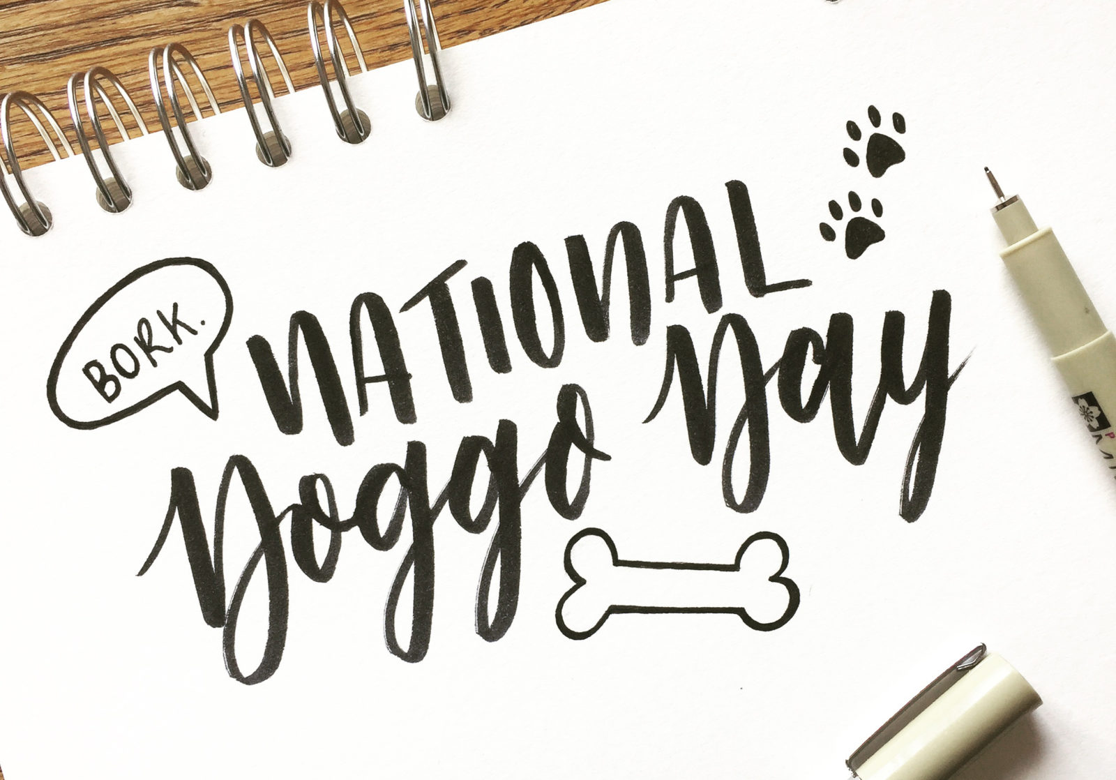
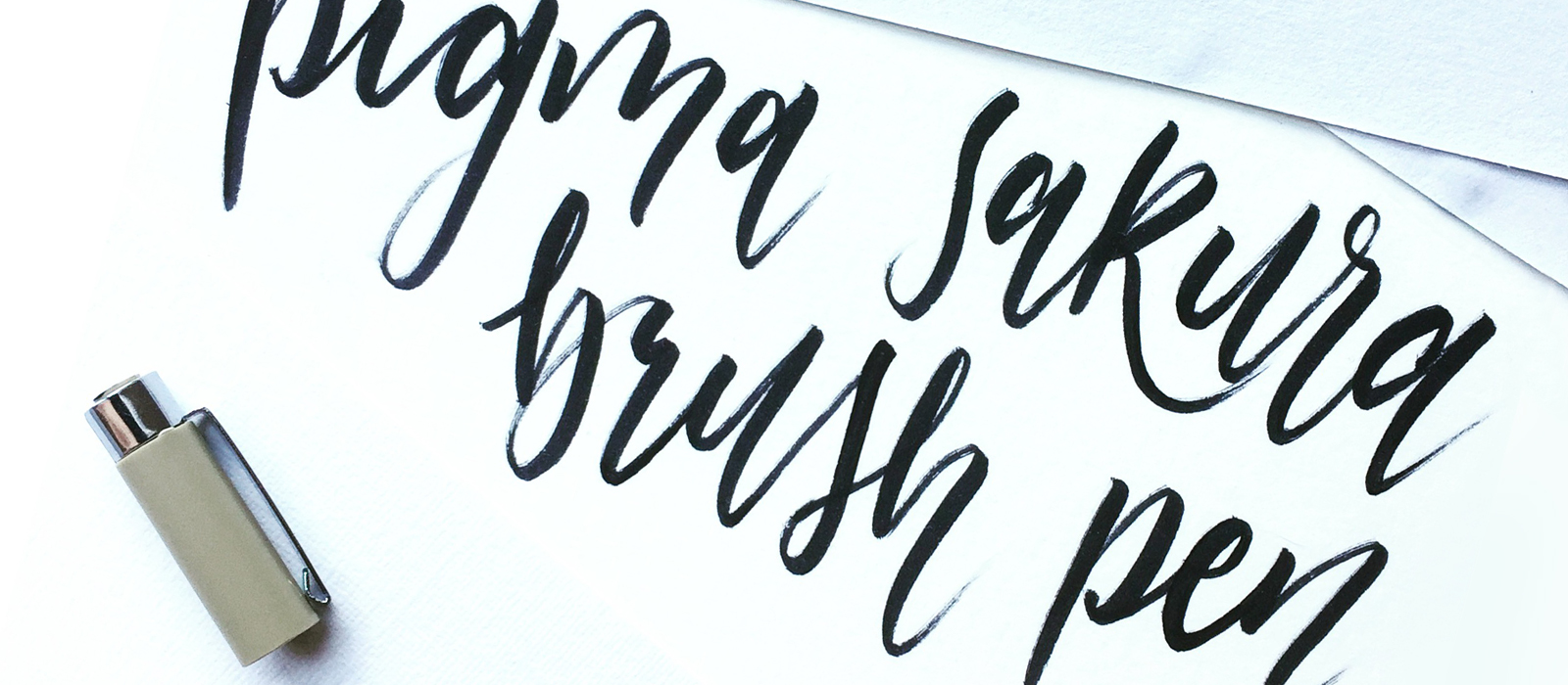
I think that all these elements are contributing factors to the current design trend, and hand-lettering slots very nicely into it. Social media feeds, especially Instagram, are full to the brim with hand lettering and calligraphic artwork. It seems like hand lettering has become a hobby for so many, all with varying levels of draftsmanship, adding their own shapes and flourishes to create their own style. Though it is a skill that takes lots of practise and knowledge of typographic form, there are so many books and resources to develop your technique that anyone can pick it up! As a serious hand lettering enthusiast (though I may be a tad biased) I would recommend anyone who has a penchant for penmanship to give it a go – let’s keep the handcrafted revolution going!! (Okay maybe revolution is a bit anarchic, let’s just go with movement…)
By Sam (a Dirty Serif and keen hand-letterer)


