Sixteen
High Street.
Industry Sector:
Hospitality (Restaurants & Bars)
Services Provided:
Branding
Design For Print
Advertising
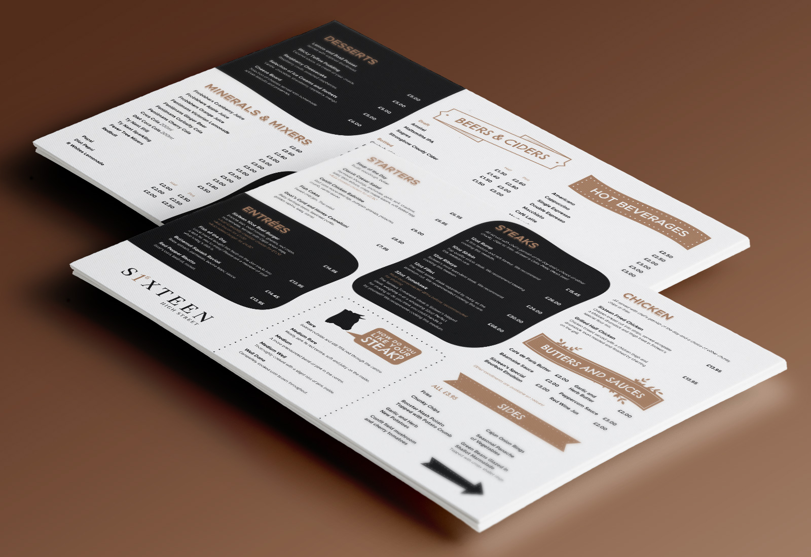
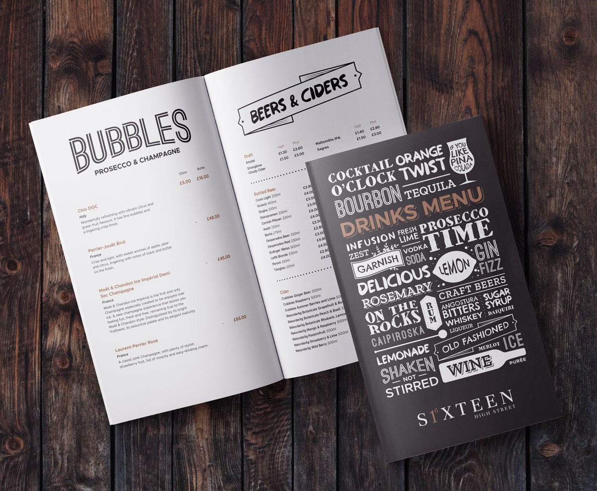
Menu Design
Marketing Collateral
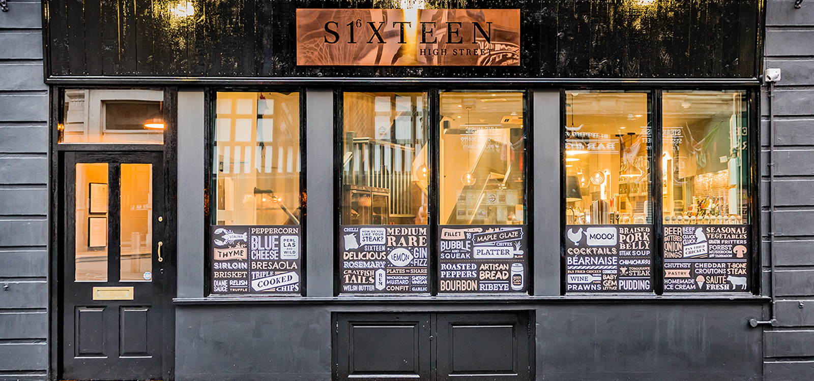
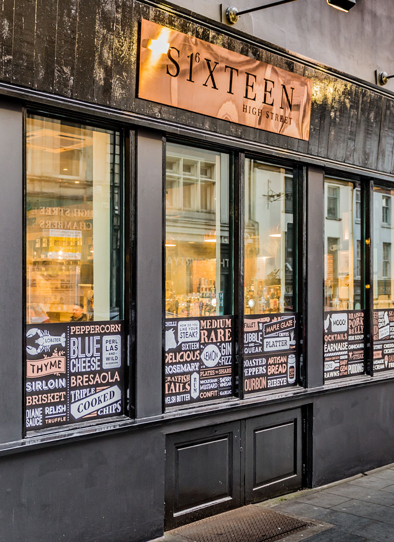
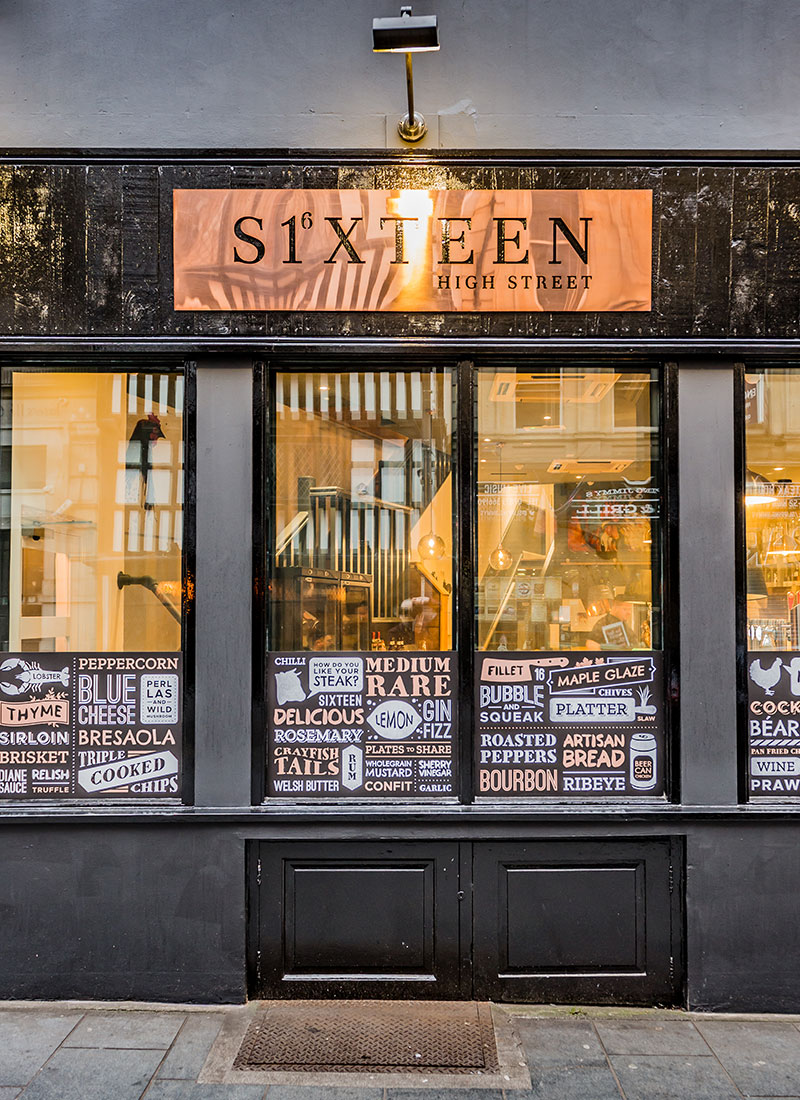
Signage & Window Graphics
Partners Worked With
Print Sauce
Photography by Craig Howarth, SeaAitch Photography. Courtesy of Niche Hospitality Ltd.
CLUCKING GOOD STEAK.
Sixteen, set in Newport High Street near Newport’s city market, offers a tasty menu designed around chicken and steak to share. Sixteen offers a wide selection of Spirits, Wines and Cocktails, and their venue features three unique spaces including the lobby, the restaurant and the terrace. Sixteen High Street is the perfect backdrop for your event or special occasion!
Read more about our case study
When Niche Hospitality approached us with their latest idea of an eclectic-style restaurant that would be serving chicken and steak to share, the Dirty Crew jumped at the chance to get stuck into the project. This would be the 5th concept by the Niche Hospitality group and from the success of the other 4 brands we’d worked on for them, we knew we had to raise our game and that the new brand had to stand out in the rapidly expanding food scene in Wales.
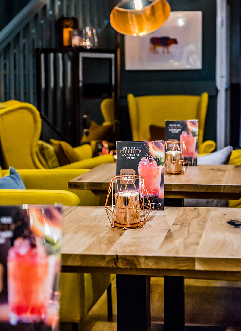
Dirty Little Serifs LOVE ideas and we RELISH a challenge, so the chance of tackling a brief of building a quirky restaurant brand with a unique concept really got our creative juices flowing. The new brand was going to be a melting pot of all of the Niche Hospitality concepts. The restaurant would be producing food, cocktails and service as sophisticated as Mojo The FoodBar and Hide & Sea, but the interior would have a more urban vibe and the tone of voice would be more tongue-in-cheek, similar to Dog ’N’ Dough.
Before the team kicked off the project, we set off on trips to London and Manchester to do extensive research into the latest movers and shakers in hospitality industry. From the research, we were able to help the Niche Hospitality team with the naming process of the new brand. What we love about branding workshops and throwing ideas around with our clients is that sometimes the most simple, obvious idea is the right one, and in this instance that was the case. The answer was staring everyone in the face. The restaurant is literally number 16 on High Street, Newport. So, Sixteen High Street was born! With that in mind, the logo for the visual identity had to reflect the beautiful simplicity of the idea and also have a hint of sophistication.
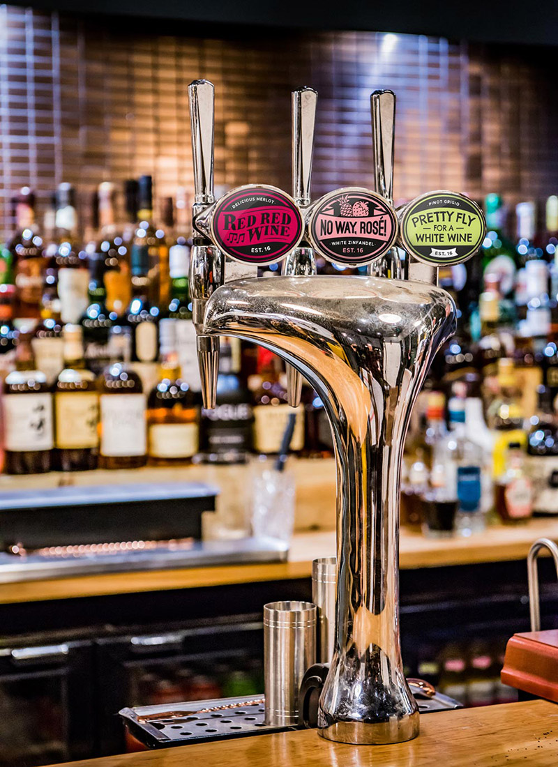
The next steps for the brand were building the graphic assets for the visual identity, so that we had a library of elements we could tap into for creating marketing collateral, advertising, signage, window decals and print material that would feature within the restaurant. This would include menu design and the badge graphics for their wine-on-tap (yes, you heard that right, Sixteen have wine-on-tap!). An important element we had to work into the brand was that it needed to mirror one of the key features in the interior of the restaurant, which was the dominant use of copper.
Then came the pièce de résistance! For this we needed the help of the outstanding signage team at Printsauce. The facade would have a 2 metre wide copper sign of the Sixteen High Street logo, which apparently, to get soooooo shiny they had to clean it with Heinz Tomato Ketchup!
The Sixteen High Street opening night launch party on the 16th November 2017 was a roaring success. The Niche Hospitality group have provided Newport with another fantastic venue that we look forward to visiting on a regular basis.

